Why UI states get messy fast in Figma
You start with one “Button” component, then reality shows up: hover, pressed, disabled, focus, loading. Add small/medium/large, icon on/off, primary/secondary, destructive, and suddenly you’re duplicating frames just to keep up. In Figma, it’s easy to create a new component for each tweak because it feels faster in the moment—until you need to change padding or corner radius and discover you have twelve near-identical buttons scattered across pages.
The mess grows because states overlap. A button can be both “disabled” and “with icon,” and the moment you model those as separate components, you’re forced to choose which truth wins. Teams then compensate with workarounds: naming hacks, hidden layers, or “final-final” components. The cost is real: slower swaps, inconsistent instances, and reviews spent arguing over which version is the real one.
What counts as a “state” worth varianting
You can variant anything, but not everything deserves to be a first-class “state.” A good rule: make a variant when the difference changes meaning or behavior, not when it’s just a one-off visual tweak. Hover, pressed, disabled, focus, and loading are usually worth it because they’re predictable, repeated, and tied to interaction. Same for size, tone (primary/secondary/destructive), and icon presence if they show up across many screens.
Skip variants for local overrides like “this one button is 2px taller in a hero,” or a marketing page color that won’t appear elsewhere. Those are better handled as instance overrides or a separate, intentionally scoped component. The practical constraint is combinatorics: every new property multiplies the set. If “State” doesn’t affect layout, copy, or accessibility behavior, keep it out of the variant matrix and document it as guidance instead.
Variants, properties, and sets—what you’re actually building

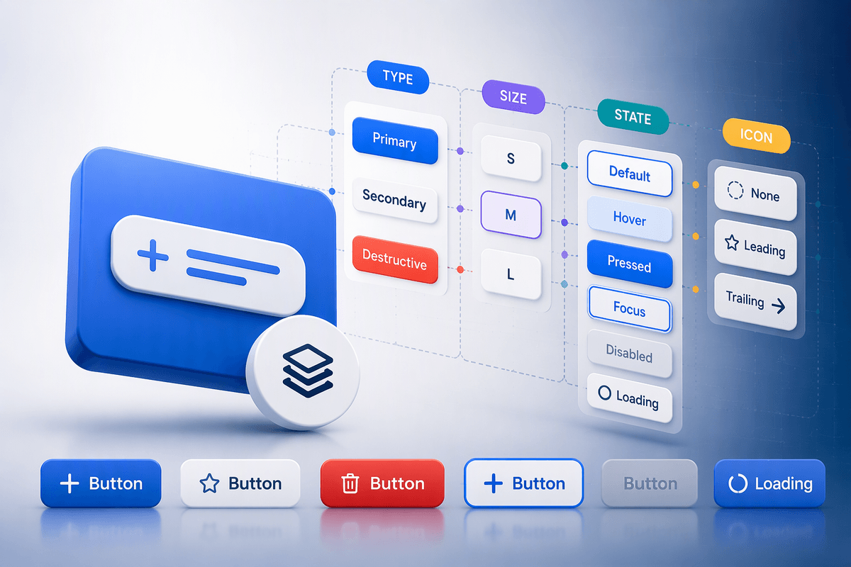
Picture what you want your teammate to do: select any button instance and flip it from “Primary, Medium, Default” to “Secondary, Small, Disabled” without swapping components. That’s what a component set gives you: one logical component with a controlled menu of combinations. Each combination is a variant, and the dropdowns you see in the right panel are properties—basically the dimensions of the matrix you’re building.
In practice, you’re defining a few properties that matter (State, Size, Tone, Icon) and letting Figma generate the rest of the wiring. The win is that layout decisions live once: padding rules, icon spacing, text style, corner radius. The trade-off is maintenance cost: every property you add multiplies testing and QA, and it’s easy to create “valid in Figma, impossible in product” combos. Keep properties crisp, avoid synonyms, and treat the set like an API your team will use under pressure.
Naming and property structure that scales past v1
You’ll feel the naming pain the first time someone asks, “Which ‘primary’ is this?” Make the variant properties do the sorting, not the component name. Keep the component name stable (Button) and put meaning into a small set of properties with predictable values: Type (Primary, Secondary, Destructive), Size (S, M, L), State (Default, Hover, Pressed, Focus, Disabled, Loading), and Icon (None, Leading, Trailing). Avoid mixing concepts like “Primary/Disabled” as a single value; it locks you into awkward edge cases and forces duplicate variants later.
Use one vocabulary across the system and treat capitalization as a convention, not personal style. If engineering calls it “pressed,” don’t name it “active.” If your file already uses “sm/md/lg,” don’t introduce “small/medium/large” in a new set. The constraint is real: renaming properties after instances exist can break expectations, documentation, and teammate muscle memory. Get the property list right early, and keep it boring.
Building a button set: from default to all states
You’ll usually start by designing the “Default” variant for each Type and Size, because that’s where layout rules get decided. Build Primary/S/M (or whatever your baseline is) with the right padding, min height, label style, icon spacing, and hit area, then duplicate outward across Size and Type before you touch interactive states. That order matters: if you create Hover/Pressed first, you tend to lock in small visual offsets that later fight your spacing system.
Once the base grid is solid, add State as the last property and generate the common interaction states: Hover, Pressed, Focus, Disabled, Loading. Keep the differences minimal and intentional: color, elevation, border, and focus ring are typical; avoid changing padding or icon position between states unless product behavior truly requires it. Loading is the one that often forces layout decisions (label replacement, spinner placement). If your loading treatment changes width, decide whether that’s acceptable or enforce a fixed width rule, because designers will notice jitter in real flows.
Before you call it “done,” sanity-check the matrix for nonsense combinations (like Disabled + Hover). Either avoid creating them, or make a clear rule that Disabled overrides other states so teammates don’t ship impossible UI.
Keeping variants usable in real files and teams
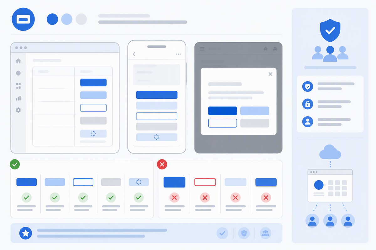
You’ll know your set is usable when someone can find the right option in five seconds, not when it contains every possible combination. Keep the property order consistent across components (Type, Size, State, Icon), and keep values short so the right panel doesn’t turn into a scrolling exercise. If a value only makes sense for one type (like “Destructive + Loading” needing special contrast), encode it in the variant styling, not a new property that bloats every other button.
In shared files, the main failure mode is “variants exist, but no one trusts them.” Add a small usage page with a few real examples and one sentence rules: which states designers should use, which ones are auto-applied by prototyping or dev, and what to avoid (like stacking Hover with Disabled). The cost is ongoing: every new property needs a quick audit pass, or you’ll quietly accumulate dead variants and teammates will start duplicating again.
A quick checklist before you commit to variants
You’re ready to variant when you can answer three questions fast: what properties are stable across the product (Type, Size, State, Icon), what values are truly reused, and what combinations are actually valid. If you can’t name the property values in the same words your team uses in specs and tickets, pause and align vocabulary first. Build only the states you’ll review and ship; “nice to have someday” variants become permanent clutter.
Check that each property changes meaning, not just styling, and that no state changes layout unless you’re okay with jitter. Decide how conflicts resolve (Disabled overrides Hover/Pressed), then delete impossible variants. Finally, test the set like a teammate would: can you swap from Primary/M/Default to Secondary/S/Loading in under five seconds without guessing?